systole.detection.interpolate_clipping#
- systole.detection.interpolate_clipping(signal: Union[List, ndarray], min_threshold: Optional[float] = 0.0, max_threshold: Optional[float] = 255.0, kind: str = 'cubic') ndarray[source]#
Interoplate clipping artefacts.
This function removes all data points greather/lower or equalling the provided thresholds and re-creates the missing segments using interpolation (default is “cubic”).
- Parameters
- signal
The PPG signal.
- min_threshold, max_thresholdfloat | None
Minimum and maximum thresholds for clipping artefacts. If None, no correction os provided for the given threshold. Defaults to min_threshold=0.0 and max_threshold=255.0, which corresponds to the expected values when reading data from the Nonin 3012LP Xpod USB pulse oximeter together with Nonin 8000SM ‘soft-clip’ fingertip sensors.
- kind
Specifies the kind of interpolation to perform(see
scipy.interpolate.interp1d()).
- Returns
- clean_signal
Interpolated signal.
Notes
Correct signal segment greather/smaller or equalling the recording threshold using cubic spline interpolation. Adapted from [1].
Warning
If clipping artefact is found at the edge of the signal, this function will decrement/increment the first/last value to allow interpolation.
The first and last values are corrected for interpolation by adding/substracting the median step observed in the time series.
References
Examples
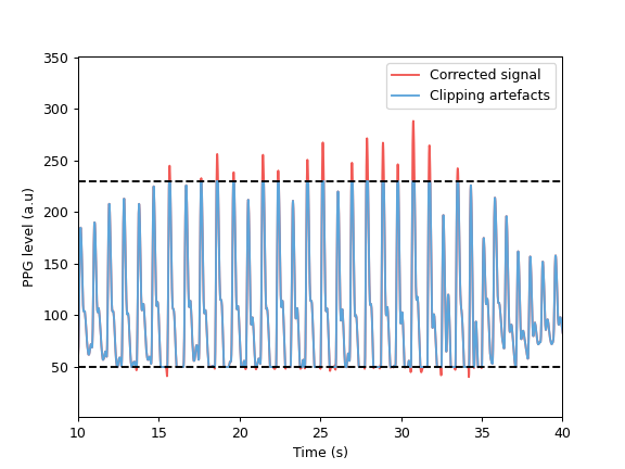
>>> import matplotlib.pyplot as plt
>>> from systole import import_ppg
>>> from systole.detection import interpolate_clipping
>>> df = import_ppg()
>>> # Create lower and upper clipping artefacts
>>> df.ppg.loc[df.ppg<=50] = 50
>>> df.ppg.loc[df.ppg>=230] = 230
>>> # Correct clipping artefacts
>>> clean_signal = interpolate_clipping(df.ppg.to_numpy(), min_threshold=50, max_threshold=230)
>>> # Plot
>>> plt.plot(df.time, clean_signal, color='#F15854', label="Corrected signal")
>>> plt.plot(df.time, df.ppg, color='#5DA5DA', label="Clipping artefacts")
>>> plt.axhline(y=50, linestyle='--', color='k')
>>> plt.axhline(y=230, linestyle='--', color='k')
>>> plt.xlabel('Time (s)')
>>> plt.ylabel('PPG level (a.u)')
>>> plt.xlim(10, 40)
>>> plt.legend()