systole.plots.plot_circular#
- systole.plots.plot_circular(data: Union[DataFrame, List, ndarray], y: Optional[str] = None, hue: Optional[str] = None, labels: Optional[List[str]] = None, units: str = 'radians', bins: int = 32, density: str = 'area', norm: bool = True, mean: bool = False, offset: float = 0.0, palette: Optional[List[str]] = None, backend: str = 'matplotlib', figsize: Optional[Union[int, List[int], Tuple[int, int]]] = None, ax: Optional[Axes] = None) Axes[source]#
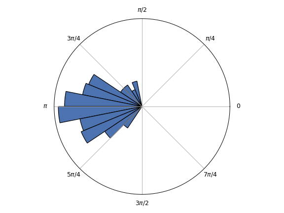
Plot polar histogram.
- Parameters
- data
The angular data in radians or degrees (see units). If a
pandas.DataFrameis provided, the values are in the y column and the colors in the hue column. If a list is provided, it should contain arrays or list of angular values. Otherwise a list or numpy array should be provided (just one condition).- y
If data is a
pandas.DataFrameinstance, y should be the column containing the angular values.- hue
Columns in data encoding the different conditions.
- labels
The conditions labels.
- units
Unit of the angular values provided. Can be “degree” or “radian”. Default sets to “radians”.
- bins
Number of slices in the circle. Use even value to have a bin edge at zero.
- density
How to represent the density of the circular distribution. Can be one of the following: - “area”: use the area of the circular bins. - “height”: use the height of the circular bins. - “alpha”: change the transparency of the circular bins. Default set to “area”. This method should be prefered over “height” as increasing the height of the bars is increasin their visual importance (area) non linearly. The “area” method can control for this bias.
- norm
If True (default), normalize the distribution between 0 and 1.
- mean
If True, show the mean and 95% CI. Default set to False.
- offset
Where 0 will be placed on the circle, in radians. Default set to 0.
- palette
Color palette. Default sets to Seaborn “deep”.
- backend
Select plotting backend. Currently, only “matplotlib” is supported.
- figsize
Figure size. Default is (13, 5).
- ax
Where to draw the plot. Default is None (create a new figure).
- Returns
- ax
The matplotlib axes containing the plot.
Notes
The density function can be represented using the area of the bars, the height or the transparency (alpha). The default behaviour will use the area. Using the heigth can visually biase the importance of the largest values. Adapted from 1.
The circular mean was adapted from Pingouin’s implementation 2.
References
Examples
Using a numpy array of angular values as input.
import numpy as np
from systole.plots import plot_circular
x = np.random.normal(np.pi, 0.5, 100)
plot_circular(data=x)
Using a DataFrame as input.
import numpy as np
import pandas as pd
from systole.plots import plot_circular

# Create angular values (two conditions)
x = np.random.normal(np.pi, 0.5, 100)
y = np.random.uniform(0, np.pi*2, 100)
data = pd.DataFrame(data={'x': x, 'y': y}).melt()

plot_circular(data=data, y='value', hue='variable')
